Visualising Trade History
A key priority of our ‘History of the Adelaide Football Club’ poster was to include data on as many aspects of the game that regularly cause debate as possible. One of the most debated topics in AFL football at any club is how well the club has fared during the trade period. Every club has its story of a disaster trade where a quality player was let go for the equivalent of spare change. Some have more than one.
So it was clear we needed to incorporate trades on our AFC poster but how should we represent them? The entire project was inspired by some really innovative work done by people in the US (check out Chartball and HistoryShots in you’re interested in US sports) but none of them incorporate the concept of trades between clubs. So we needed to come up with something new.
In any trade, we have some ‘asset’ brought into the club in exchange for some other ‘asset’. In this case we consider an ‘asset’ to be a player and/or a draft pick (or multiples thereof). So to represent it visually, we want to compare what comes ‘in’ with what goes ‘out’. That’s the basic concept for our representation on the AFC poster – we have an ‘in’ arrow to show the quality of the incoming assets and an ‘out’ arrow to show the quality of what left the club.
Next question – what does ‘quality’ mean? How do we rate a given trade? We wanted a measure that was really simple and yet still provided a decent way of assessing the quality of a trade for either side. We thought about trying to come up with some complex formula that included Best & Fairest and Brownlow votes and DreamTeam or SuperCoach points but in the end we felt it would be too convoluted and difficult for the casual fan to grasp quickly. So we decided to use the most simple of measures – games played. It’s not perfect but the number of games that a player plays is a very commonly used metric and most fans understand what a ‘good’ number is.
Sounds easy, right? We have an arrow that varies in length based on how many games the player coming in played and compare that with an arrow that represents the number of games the player going out played. Here is an example of that most simple of situations:

The Crows narrowly ‘lost’ this trade according to our measure because McCartney played 107 games for North Melbourne but Stevens only played 101 for the Crows.
So far so good – but unfortunately it’s not always so easy. Firstly, what about draft picks? When Adelaide traded Anthony Ingerson for pick 27 in the 1995 draft, how do we decide what that pick was worth? There is no way to know who Melbourne would have picked in this situation so the only sensible option is to compare the player who was actually taken (in this case Kane Johnson) and use his games played as the measure. So here the trade is Anthony Ingerson for pick 27 which ended up being Kane Johnson, as shown:

This example also illustrates a point about measuring trades. Our assessment shows the Crows ‘losing’ this trade as Johnson ended up playing 104 games for the Crows (before being traded to Richmond) whereas Ingerson played 121 for Melbourne. Not many Crows fans would be upset with the trade, however, given Johnson ended up a dual premiership player and was influential through the midfield in his seven years at the club.
The next issue we faced was the complexity of some trades. What happens when players, or more often, draft picks, are on-traded? One of the more controversial trades in Adelaide’s history is the infamous Wayne Carey trade. It is also a lot more complicated that you might remember. Most think it was the Crows trading pick number 2 (which ended up being Daniel Wells) for Carey in the 2002 draft. But Adelaide finished 3rd in 2002 so how did it get pick 2 in the first place? The answer is that in that same year, Kane Johnson requested a trade back to a Melbourne club. As part of that deal, the Crows received pick 2 and then on-traded that to North Melbourne for Carey. Other players including Jason Torney were also involved to make it even more complicated. Adelaide never really had pick 2 because it was only involved in the discussions to make the entire series of trades happen. So how do we represent this? It seems unfair to suggest that Adelaide traded pick 2 for Carey when it never really had that pick. In this case, the trade is shown as one large transaction incorporating everything the Crows ended up trading out compared with everything they ended up trading in:
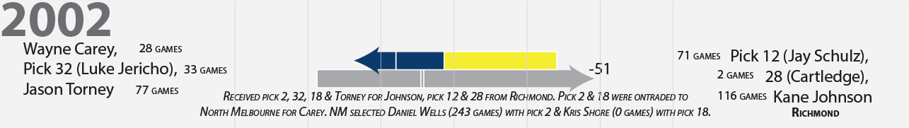
For completeness we explain the fact that both North and Richmond were involved in the trade and the players that were ultimately selected with the picks that were exchanged. We felt that showing it this way was a closer representation of what actually happened and helps to make all the trades more consistent across the poster. In the end, we are really interested in what came ‘in’ compared with what went ‘out’.
Things will only get more complicated and difficult to measure from now on given that trades can now include future draft picks as well (the Crows traded their 2016 second round pick to GWS for Curtly Hampton in the 2015 draft).
So, what do you think of the decisions we made here? Is there another fairly simple way to rate trades? Any ideas on how to show complicated trades more clearly?
Investigate these issues and more with InfoVisuals new History of the Adelaide Football Club poster. Every game, every player, every trade and every draft are shown in one engaging poster. For more info check out www.infovisuals.com.au